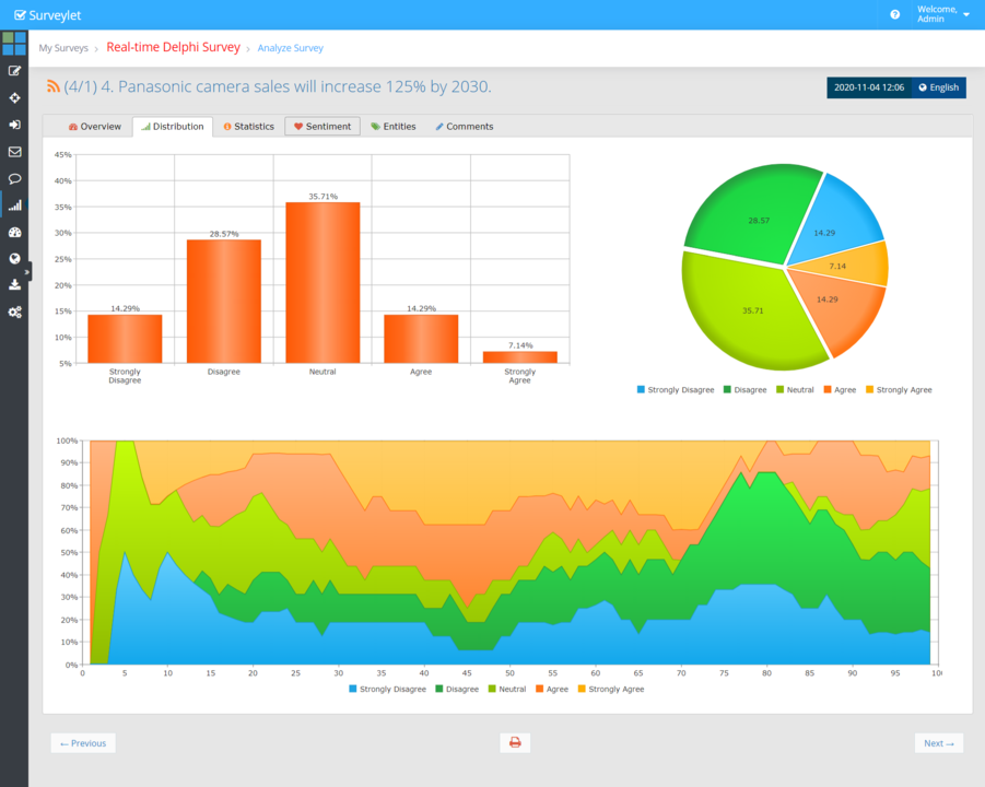
Distribution Tab
A distribution in statistics is a function that shows the possible values for a variable and how often they occur. The Distribution tab of the Analyze Survey page displays three distribution charts.
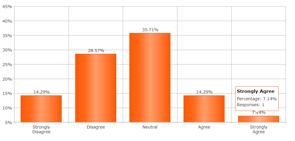
Vertical Bar Chart
A bar chart depicts numeric values against distinct categories in a two-axis plot. On one axis, the category levels are listed. For each category, one bar is plotted, and its length along the other axis corresponds with the numeric value associated with the category. The example bar plots below show how a user base is divided among different choices.
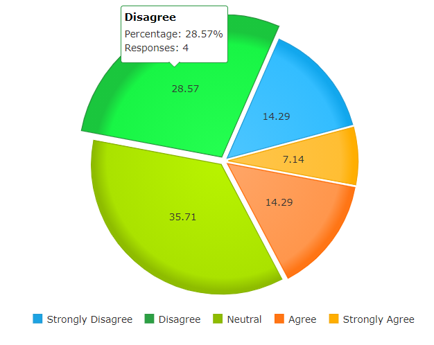
Pie Chart
A pie chart shows how some total amount is divided among distinct categories as a circle (the namesake pie) divided into radial slices. Each category is associated with a single slice whose size corresponds with the category’s proportion of the total. The figure below plots the same data as above, but using the pie chart form instead.
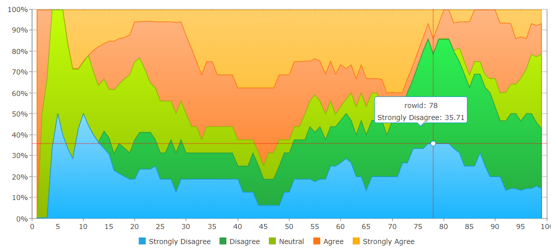
Historical Line Chart
A line chart is a type of chart which displays information as a series of data points called 'markers' connected by straight line segments. A line chart is used to visualize a trend in data over intervals of time – a time series – thus the line is drawn chronologically. They are known as run charts. The Line Chart on this page displays the distribution values collected over a period of time. Each point in the x-axis represent an event in time, where the event is generated when a new response is received or an existing answer is revised for a question. The events are not distributed in time equally; they may not happen at the same intervals.